The amount of new wefox customer creations was low and the main goal for the quarter was to improve the signup rate significantly. Therefore, we needed to understand the pain points of the current registration flow and find out how to improve it. With the product manager, we run several user interviews to find out the main pain points in the current flow.
From there, I worked alongside our engineering teams for web, iOS and Android to design a better experience and also an updated design system.
To register, the user had to undergo a few steps. One involved answering some personal questions to create a profile, furthermore, there was a mandatory meeting with one of the company’s insurance brokers. The entire user flow looked like this:
Constst of approx. 15 questions in order to create a "risk" profile of the new customer.
Mandatory meeting with an assigned personal broker to discuss the customers needs.
Creating the wefox account.
Account verification through email verification.
Additional personal information about the customer.

The questionnaire at the beginning took quite a long time (approximately 15 questions depending on the individual answers) and involved some personal questions such as smoking habits, health questions or income.
Our main hypothesis was that the questionnaire was too personal and took too much time to finish, which would be one of the main reasons for the low registration. Therefore, we decided to conduct some user tests to understand their pain points during the process. Each test was held with one interviewer and one observer who took notes during the interview on a logging sheet. The user tests were recorded (with the participant’s consent). During this process, I worked closely with the Product Manager who usually took part in the interviews.
Because of the several steps involved in the registration process, we decided to 2 different tests:
Discover and understand the pain points and frustrations of our potential customers during the whole registration process
Usability evaluation of the overall flow and understanding of how easy the user can sign up.
Finding out how the questionnaire is perceived in general and our hypothesis is correct.
While testing only the questionnaire alone, we found out that the users found it very easy to manage and understandable. The overall reaction was quite positive.
It turned out that our hypothesis was wrong. The questionnaire itself felt easy and not too long and is therefore not the main reason for low registrations.
Surprisingly, personal questions were expected and were answered without much hesitation.
For most, the whole questionnaire journey felt positive and most importantly helpful to understand what type of insurance is needed based on personal circumstances.
Most of our testers were somewhat confused with the registration flow. At this stage of their customer journey, they expected a simple and easy sign-up with minimal questions to be answered.
More than half of our testers would have discontinued the registration once they realised how many steps were involved.
Most users preferred to register first and to decide by themselves if they wanted to take the risk assessment and when.
Most testers were not sure if they wanted some insurance recommendations at this stage in the journey. Questioning this step made them not want to continue with the registration.
Most testers did not understand the point of having a meeting with a broker.
There were several main paint points that had to be considered in order to have a successful registration, but also meeting the expectations of stakeholders and the insurance brokers of the company. For both, stakeholders and brokers it was crucial to collect as much information about the customer as possible. This helps to sell the right insurance and to be able to provide the best customer service. Therefore, the broker appointment and questionnaire were important.
The testing insights showed that the questionnaire was indeed helpful and positive, however, it was just placed in the wrong place in the customer journey. Since the quarterly KPI was to increase customer registrations, we decided to purely focus on registration first and decided to remove the broker appointment and questionnaire to reduce the registration to a minimum of data points. The user tests showed that for people who are ready to register, the process needed to be made as simple as possible. In the second part, we would focus on including the questionnaire and broker appointment in the best possible way for users to access.
New registration will be only 2 steps of the flow. The main priority is to improve both steps for a better and faster experience.
All 3 steps will be removed for account creation. They will be moved to a different place of the customer journey.
Trying to be as transparent as possible by removing all questions and concerns about safety.
The overall design was very outdated and not accessible which can lead to a lack of credibility. Therefore, the Design System needed to be updated with an improved experience as well as an overall design style.
Forms and Buttons were not accessible according to WCAG standards. The content hierarchy was not optimal and needs improvement.
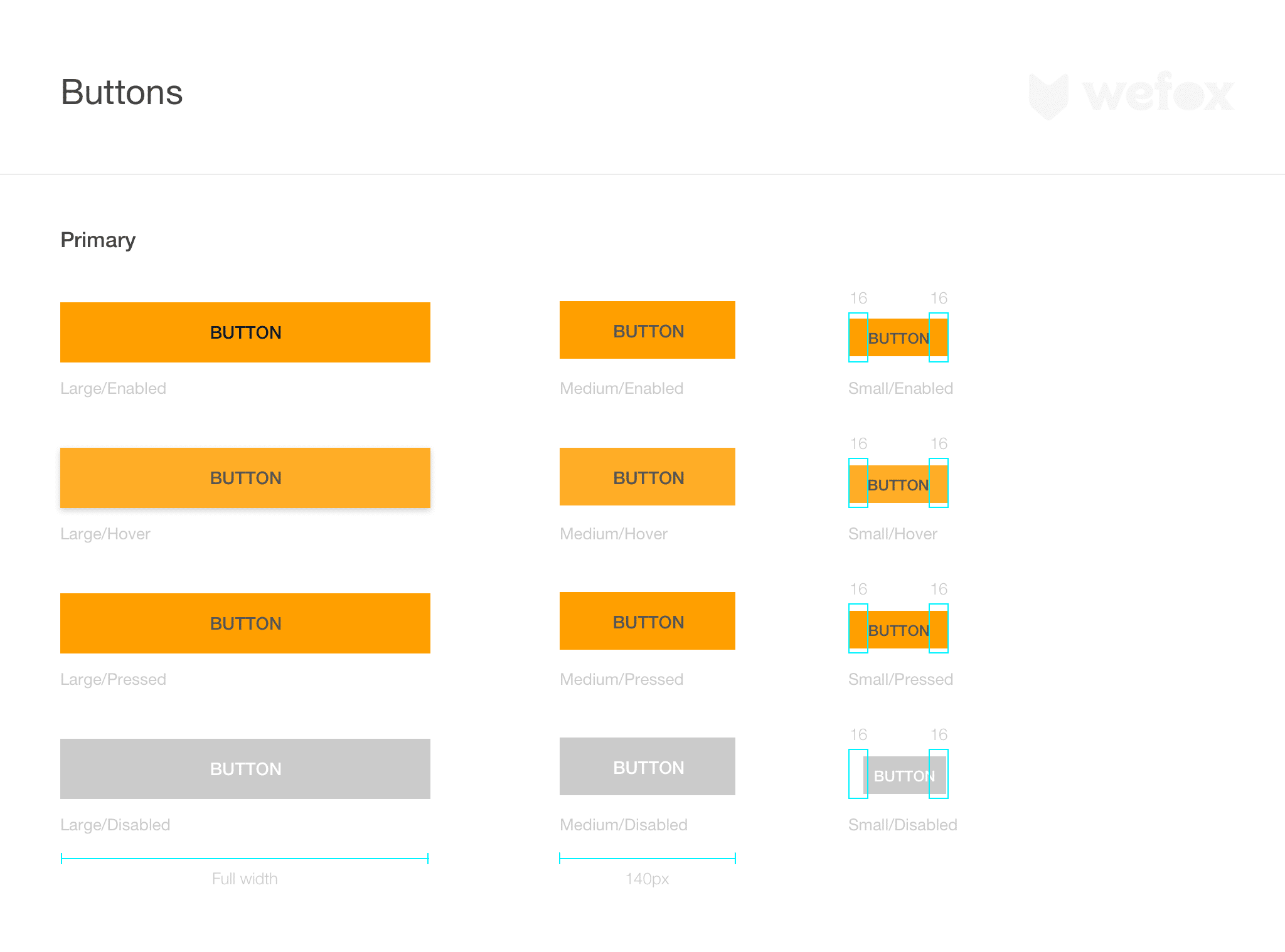
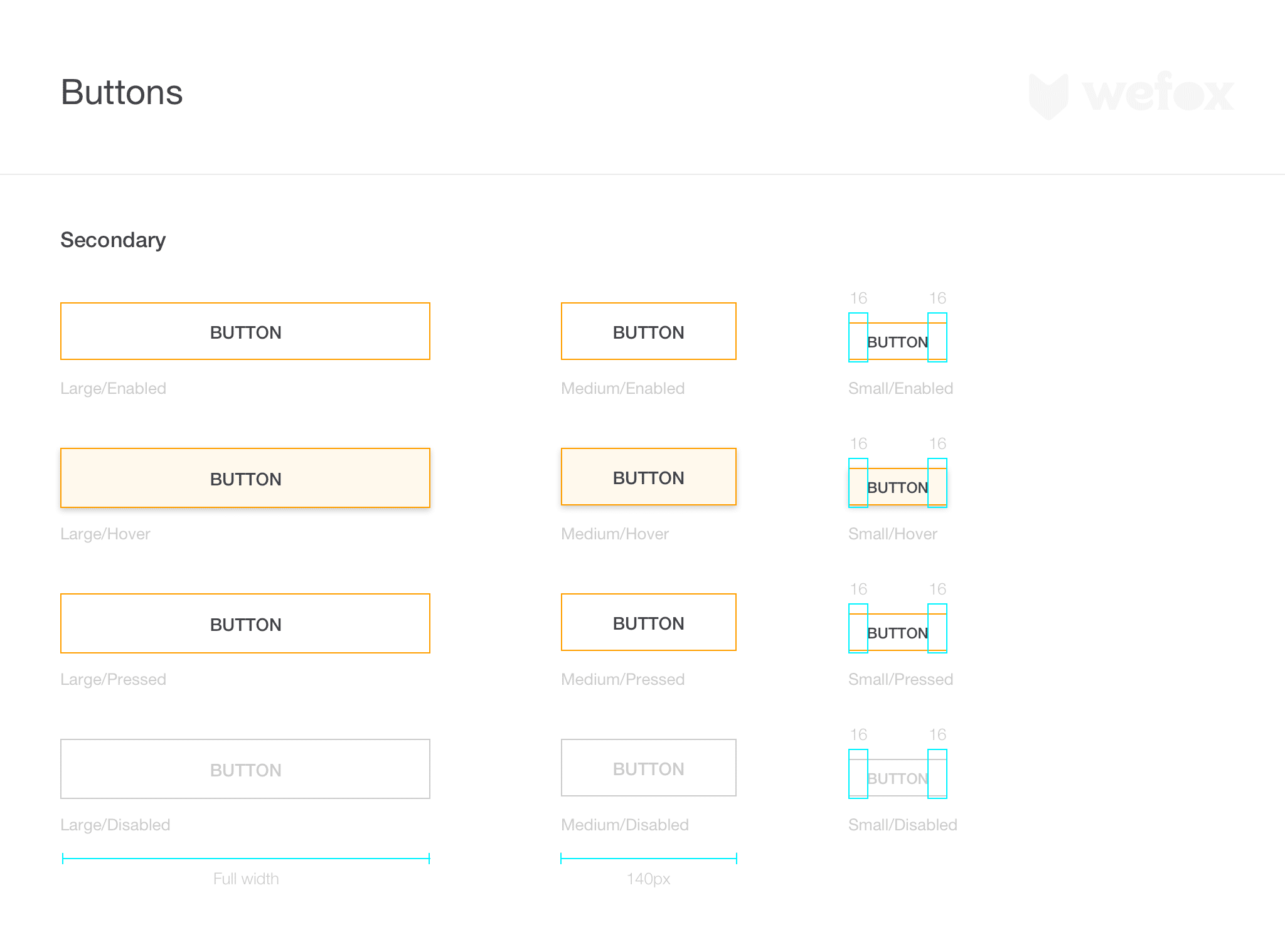
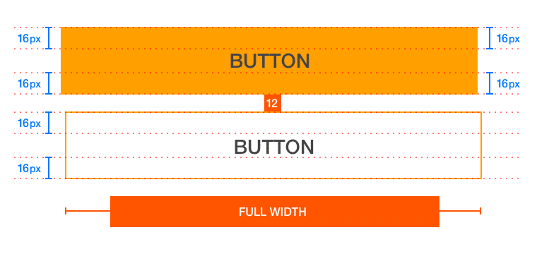
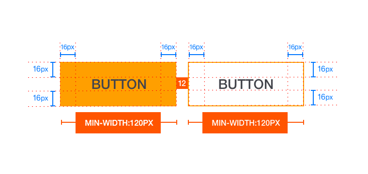

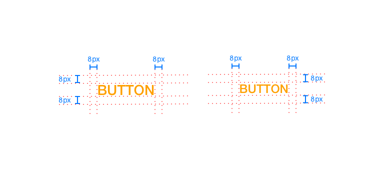
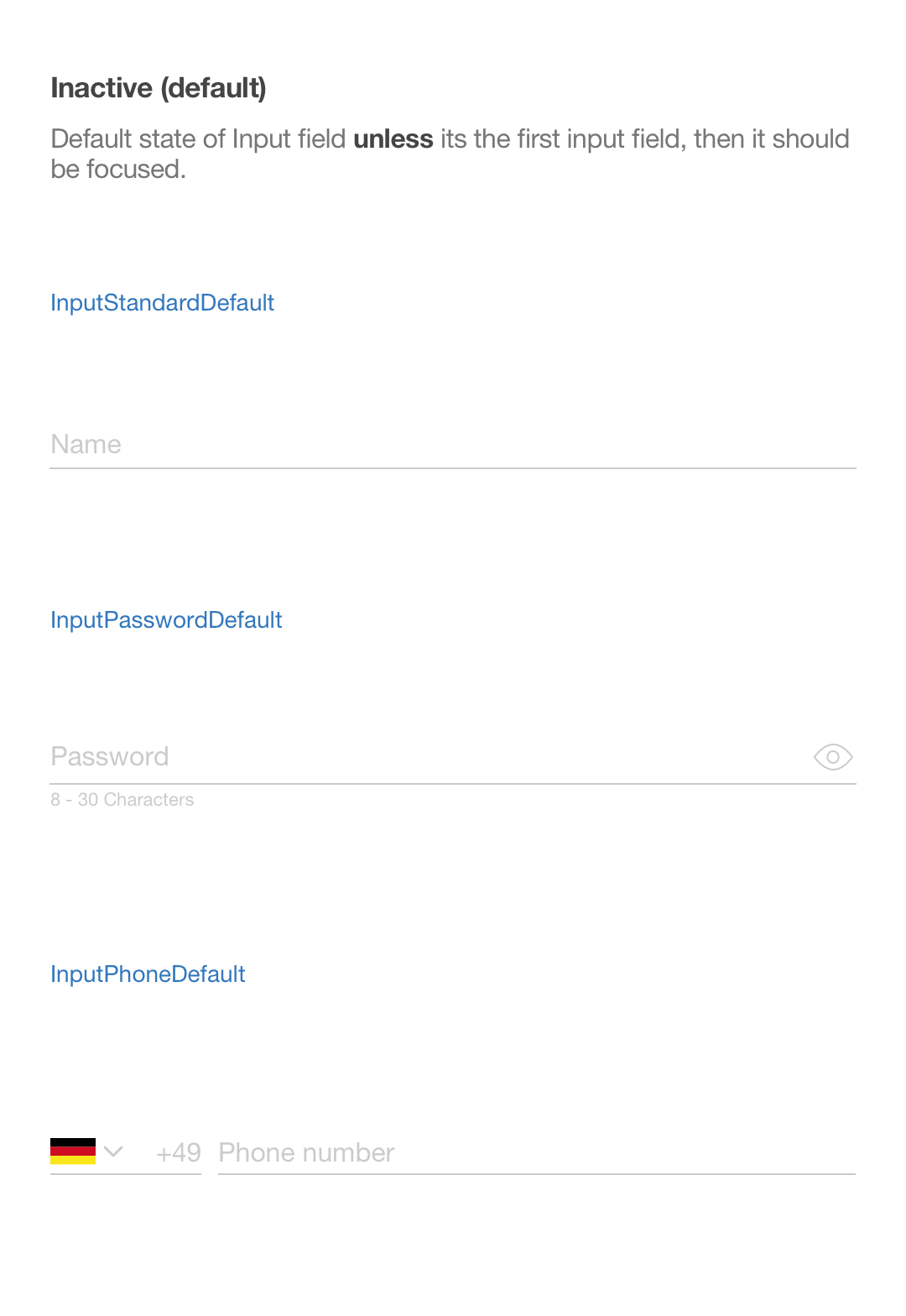
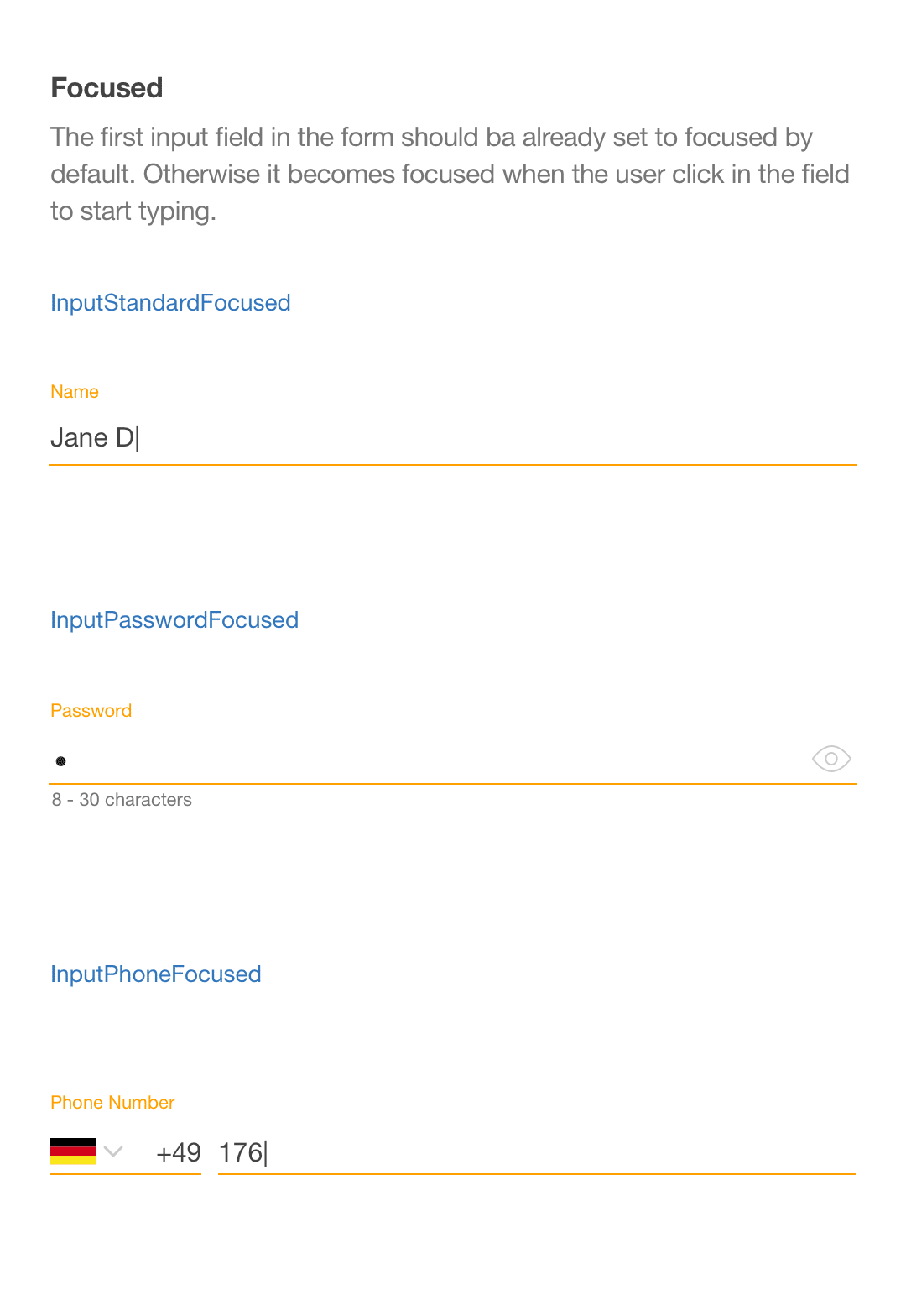
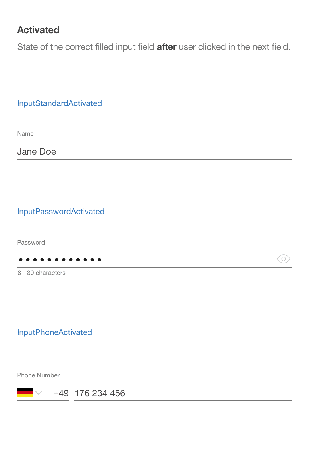
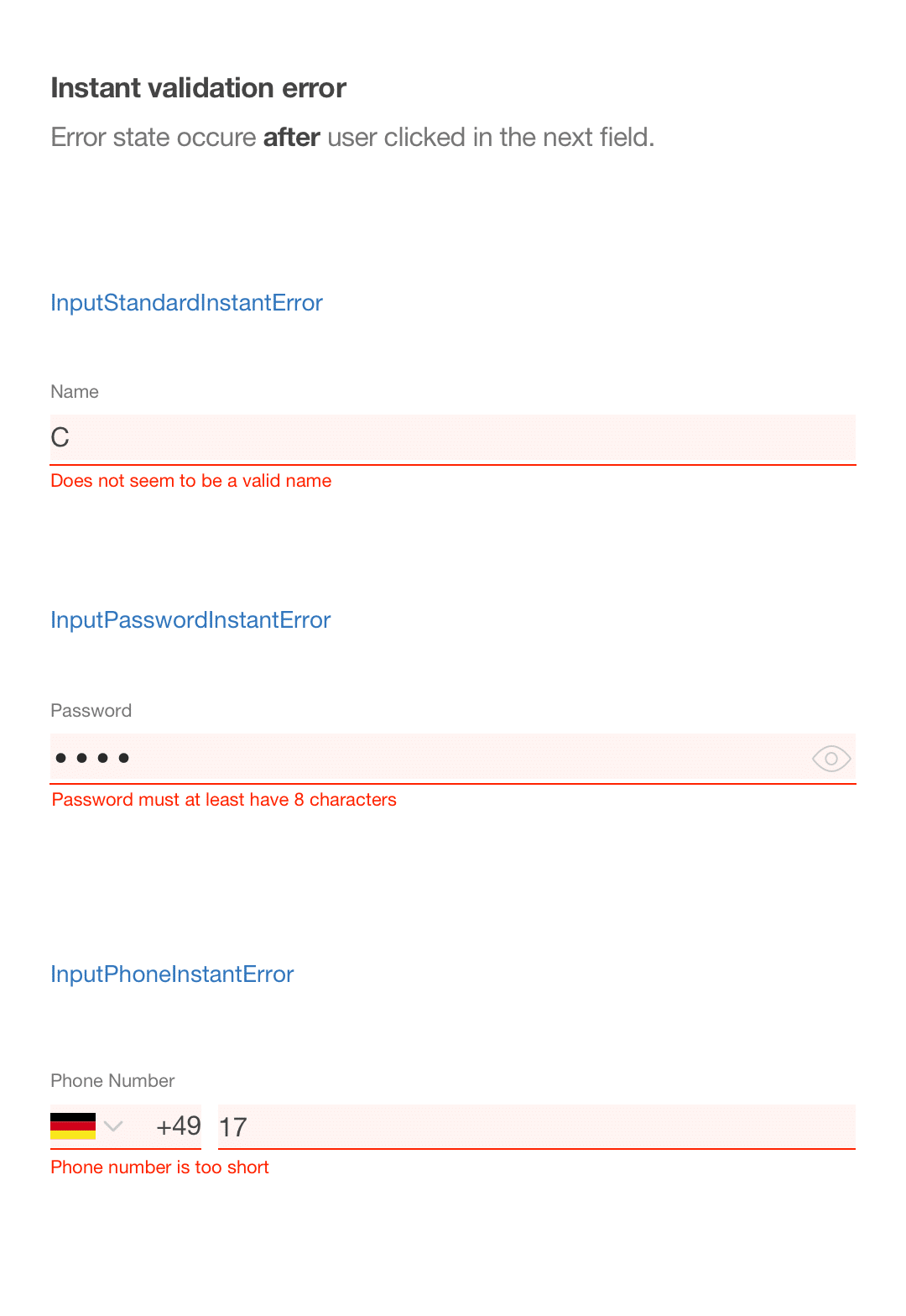
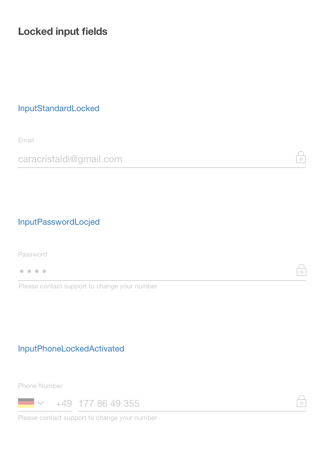
Formfields based on material design standards
Improved color usagefor better experience
For the stakeholders in the company, it was of course very crucial to collect as many data from the customer as possible. The suggestion of removing the questionnaire as well as a mandatory broker appointment was not taken very well. It took a few discussions and compromises to make everybody comfortable with this decision.
This project was my first task at wefox and it helped me a lot to understand that product designers always need to consider the business needs as well to make the best possible design decision.
The first design iteration of the new registration originally did not have the phone number involved. As verification, we only had an email sent to the customer that needed to be confirmed. We tested the new design with some of our internal brokers to get their take on the new design as well.
As it turned out, most of asked brokers wanted to have the phone number of new customers to be able to call and discuss their needs. For them, it was necessary to be able to reach them and to do their jobs. This insight was very helpful to us and luckily found at an early stage. We changed the verification to be via phone number.
After the user tests, we learned that there were 2 big changes to be done. This task helped me to learn that sometimes, not everything can be done at once.
If this happens, it is important to be able to make decisions and to prioritise the task that is focused on the KPIs and ultimately gets the desired result.