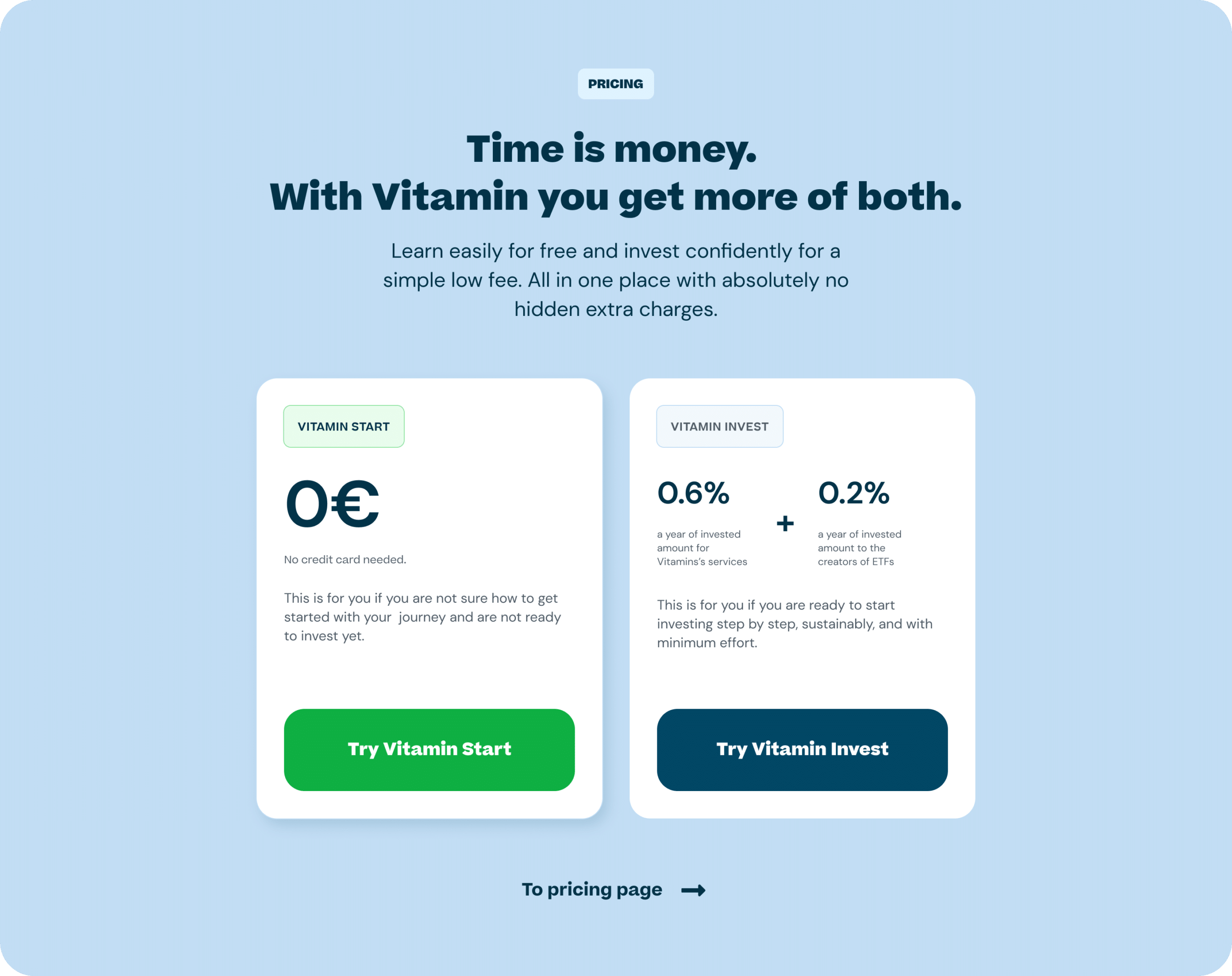
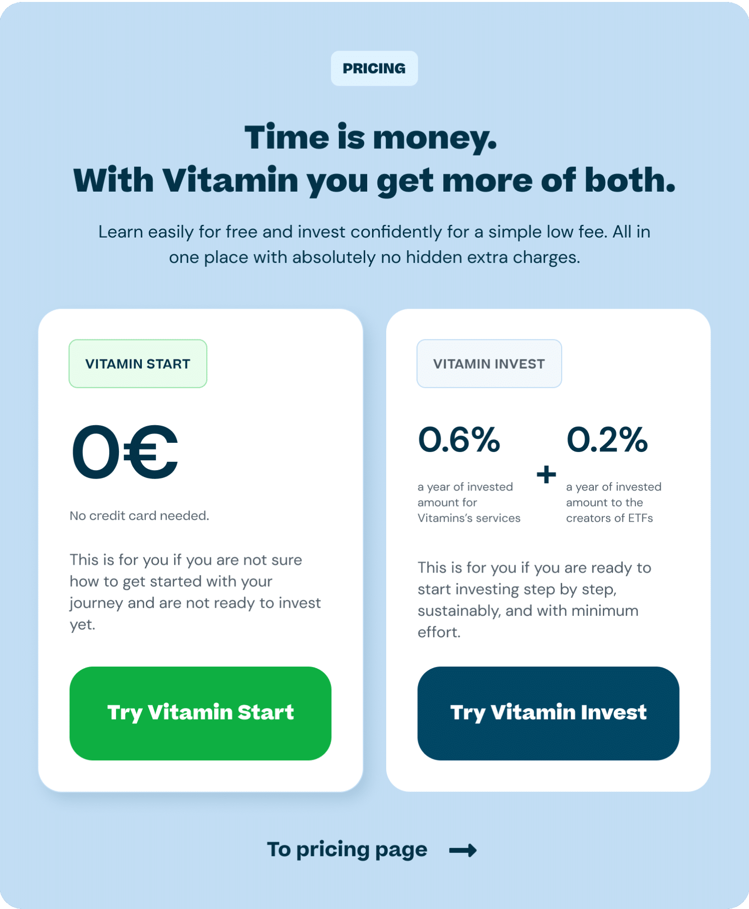
Vitamin is an investing platform targeted at women. The mission was to power financial futures for all women and become women’s integrated financial companion, offering guidance to their life circumstances to achieve their goals.
Until recently, the company was only offering advice on investing, but now it was able to offer investment portfolios for women as well. This needed to be reflected on the website in order to drive new user registrations.
Vitamin was working with an external brand agency to find a bold, strong and powerful brand. Although vitamin was a fintech company, the branding around it was made to be a lifestyle brand, making investing and finance less dry and boring, but more delightful and more importantly, easy. The brand had several bold main colours to give it a distinguished look from other investing-related brands and a bold logo that was used together with imagery.
Although the colours and styles were bold and fresh, the existing website was still lacking the “delightful” experience we were looking for.
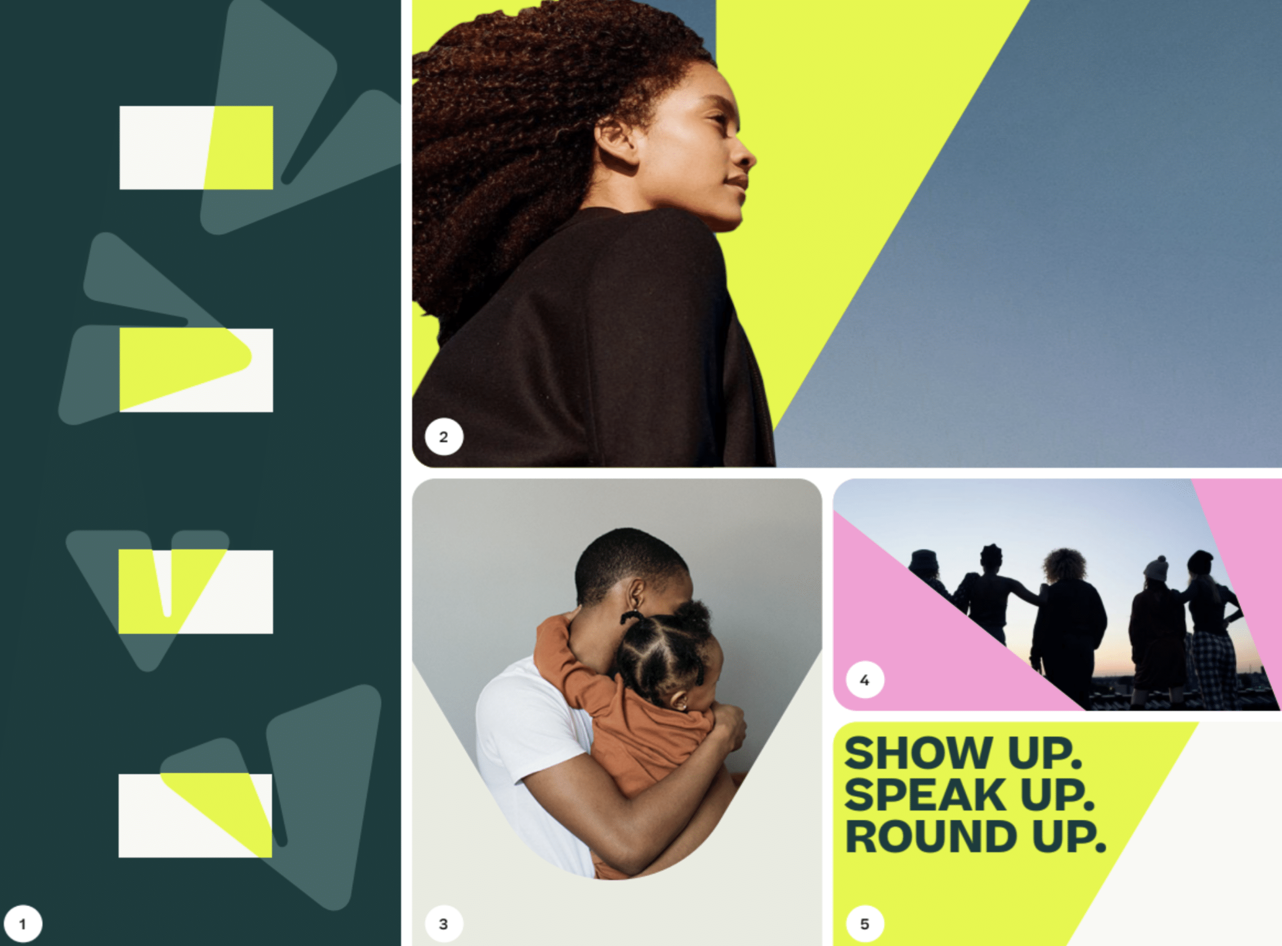
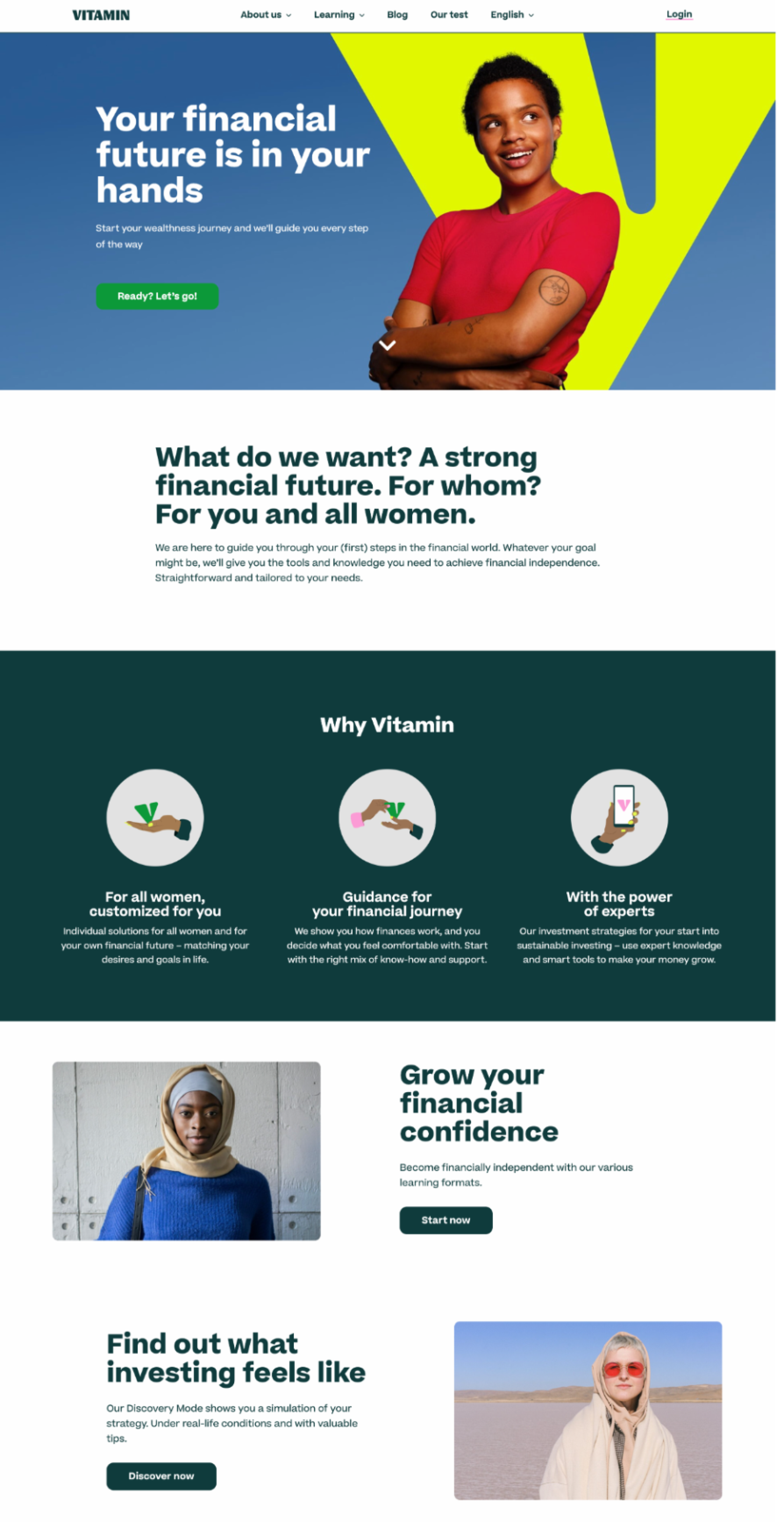
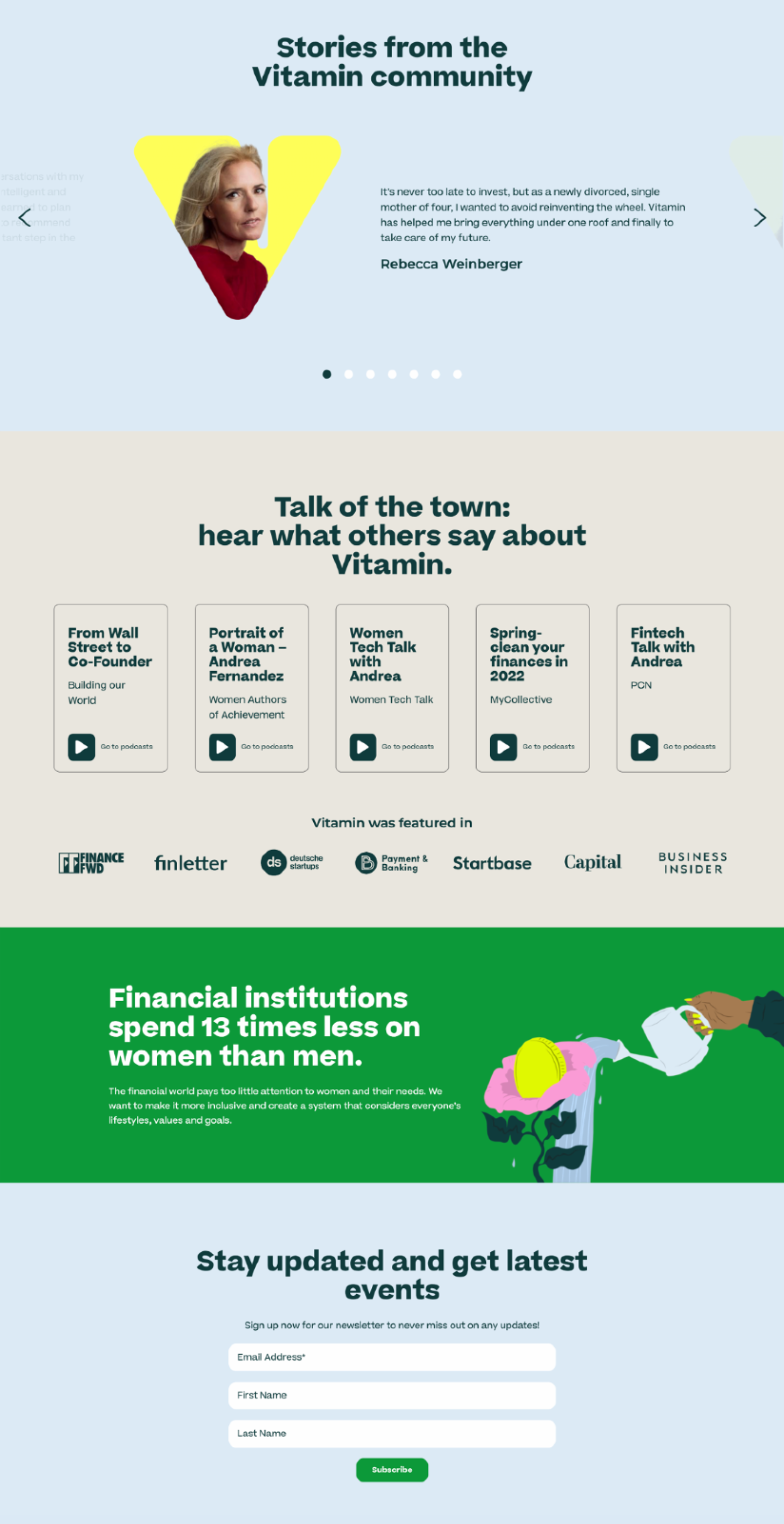
After conducting the design audit of the brand guidelines and the existing website, we were able to pinpoint several issues that needed to be resolved:
Colors
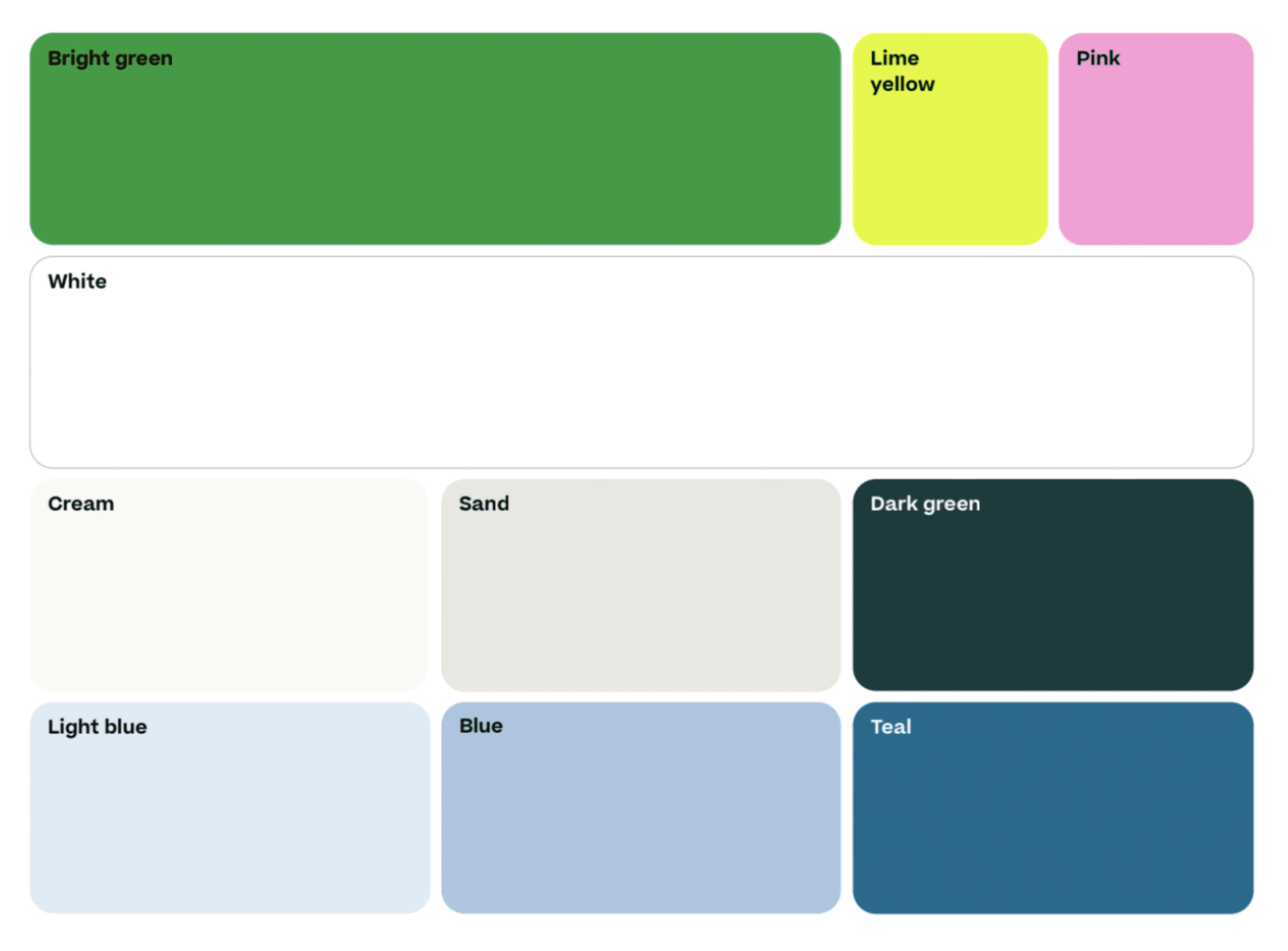
The colour palette needed to be expanded. There was a lack of contrast and not enough light and dark colour variants to build a well-curated digital product and a working user interface that is consistent with the brand and mission.
Imagery
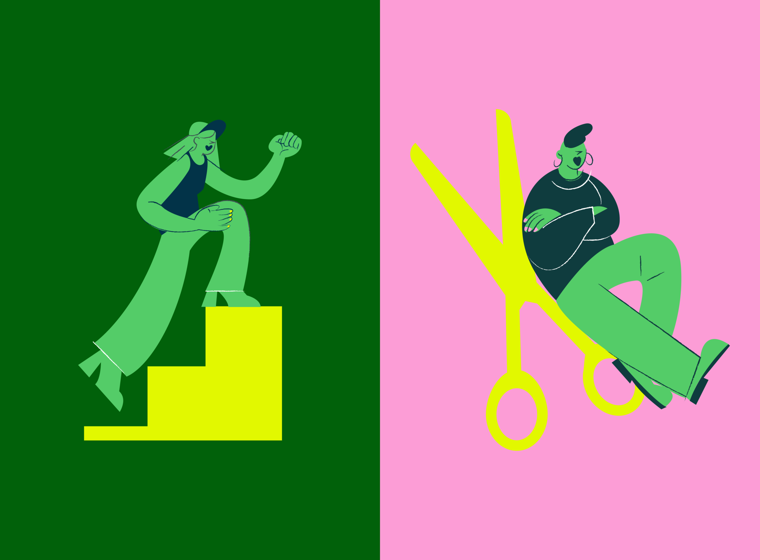
Women as imagery in various shapes or the "V" shape logo feels very distracting. since the topic of investing is already very complex in itself, we had to find a solution to provide cleaner and more essential visual elements.
Illustrations
The brand comes with several Illustrations mainly to help visualise vitamins' main usps. However, there were no rules in place as to where, how, and when to use the Illustration throughout product and web. There was a need to find a way to make Illustrations and imagery work alongside each other
Overall Delight
Looking at the current website, it was clear that the aspect of delight was not well incorporated. The website did not reflect vitamins' mission and still seemed complex and heavy. The bold colours were not represented enough.
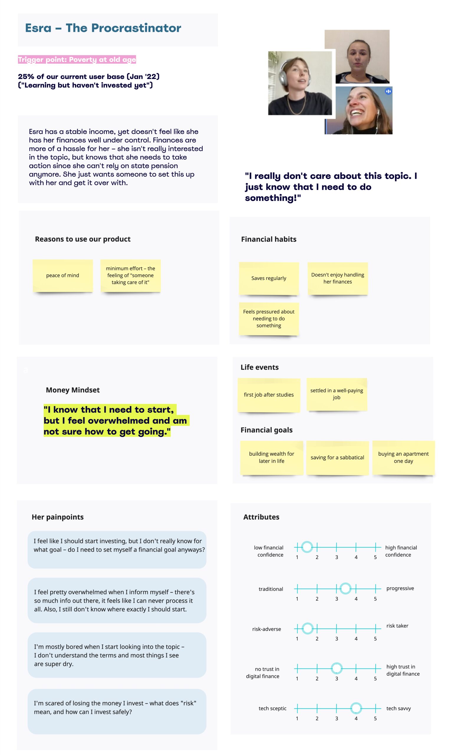
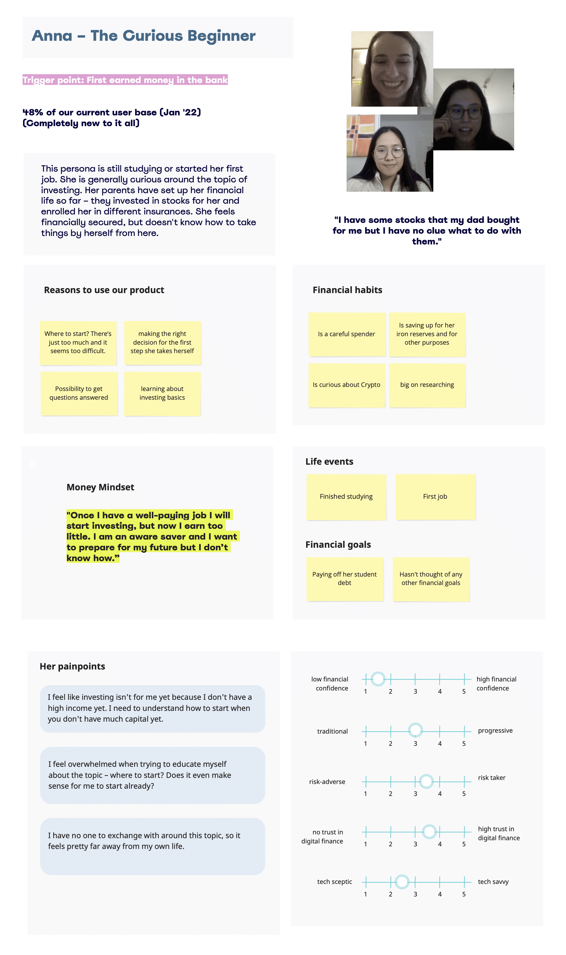
In order to understand how we can improve the current website design and strategy, we needed to define our user’s main pains and understand the areas where we should focus on.
First, we took a look at our main personas and the main needs we needed to solve:
Guidance
The need for a sense of belonging and guidance
Peace of mind
Minimum effort and ease
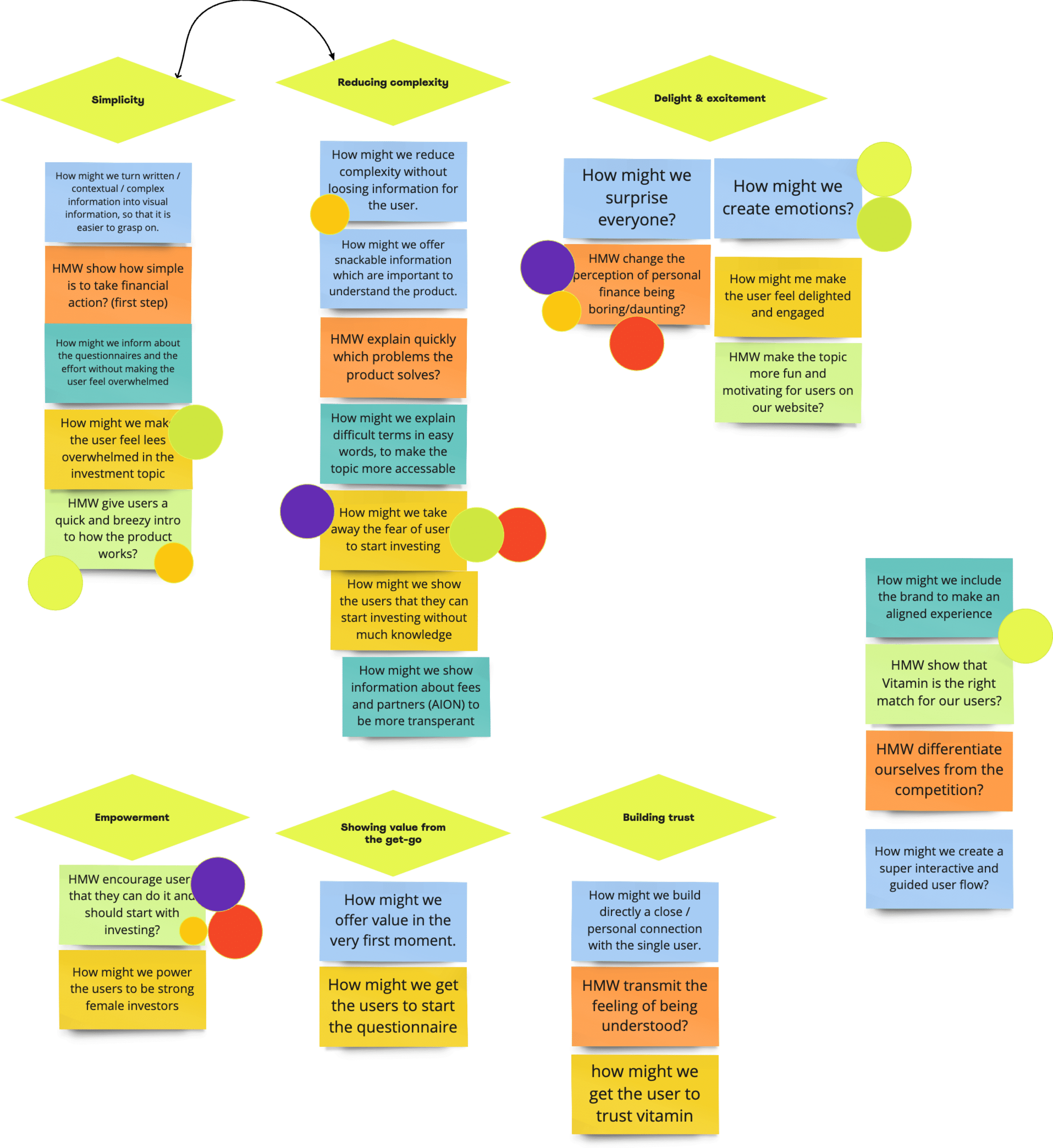
How might we take away the fear of users to start investing?
How might we help the user to take the first step?
How might we change the perception of investing being daunting?
How might we create emotions?
We had To find a better visual style that reflects our mission and brand styles and resonates with our target group, we had a workshop to brainstorm and collect ideas.
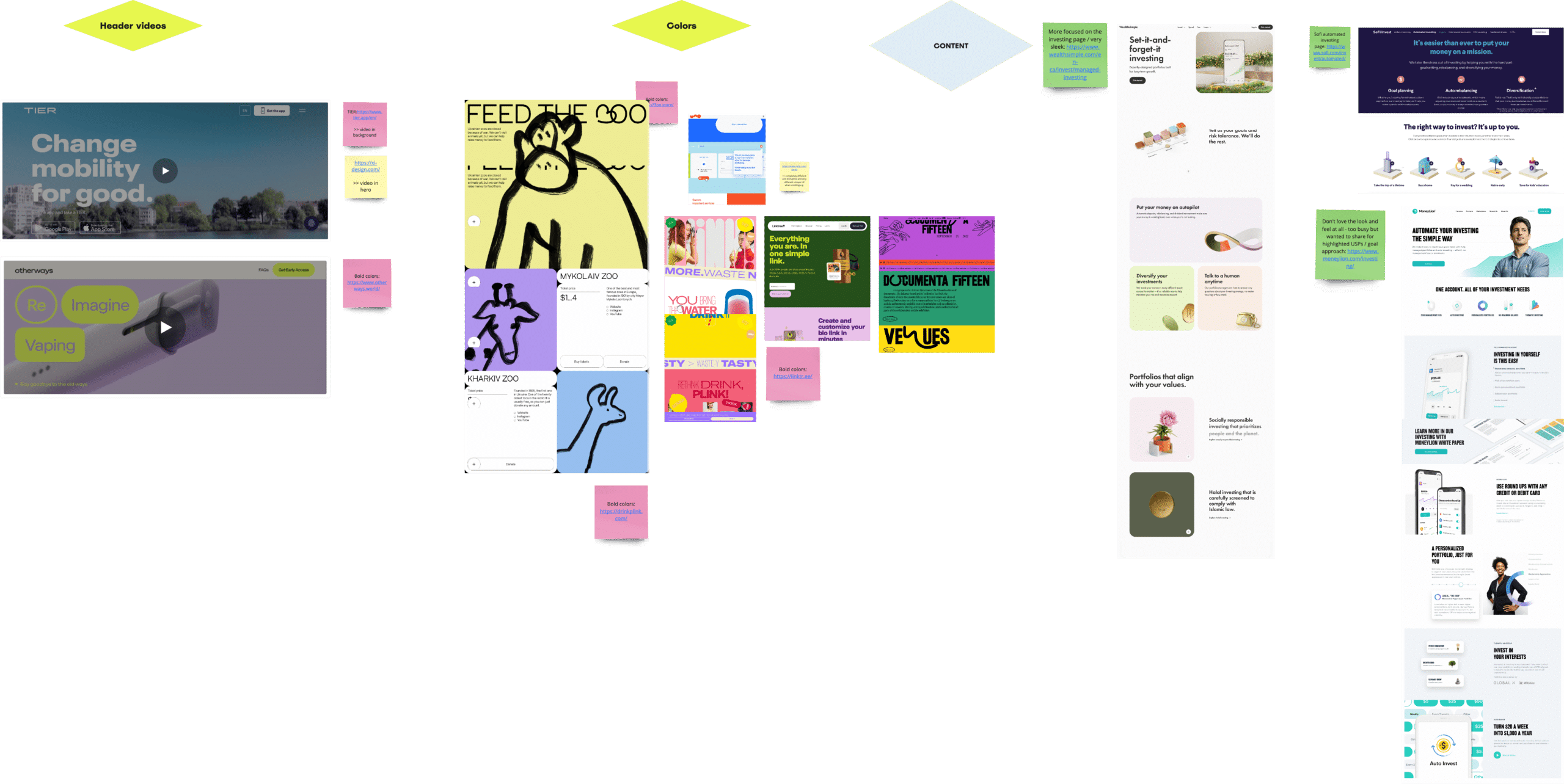
Using videos instead of complex content to help understand the investment topic and create a more delightful approach.
UI that looks and feels fresh (bright brand colours, UI elements), uplifting and personal (illustrations and inclusive, relatable copy) because we believe it can be our differentiator in the FinTech space as well as excite our users about a process that usually isn’t that fun.
Take out as much complexity and distraction of our content to define an understandable language, yet doesn’t oversimplify financial terms.


Bold colors
Replacing the neutral colours with the fresher and more uplifting brand colours.
Animanted videos
Using video snippets as header visuals to speak an easier and more engaging visual language
Rounded corners
creating a strong but feminine approach by using rounded corners and "softening" the complex product.
Bold colors
Replacing the neutral colours with the fresher and more uplifting brand colours.
Sliding elements
Using sliding elements to provide extra information and make the website feel not as content-heavy.


Consistent styles for imagery
Instead of combining complex shapes and images, we only use simple shapes such as rectangles with rounded corners or circles.

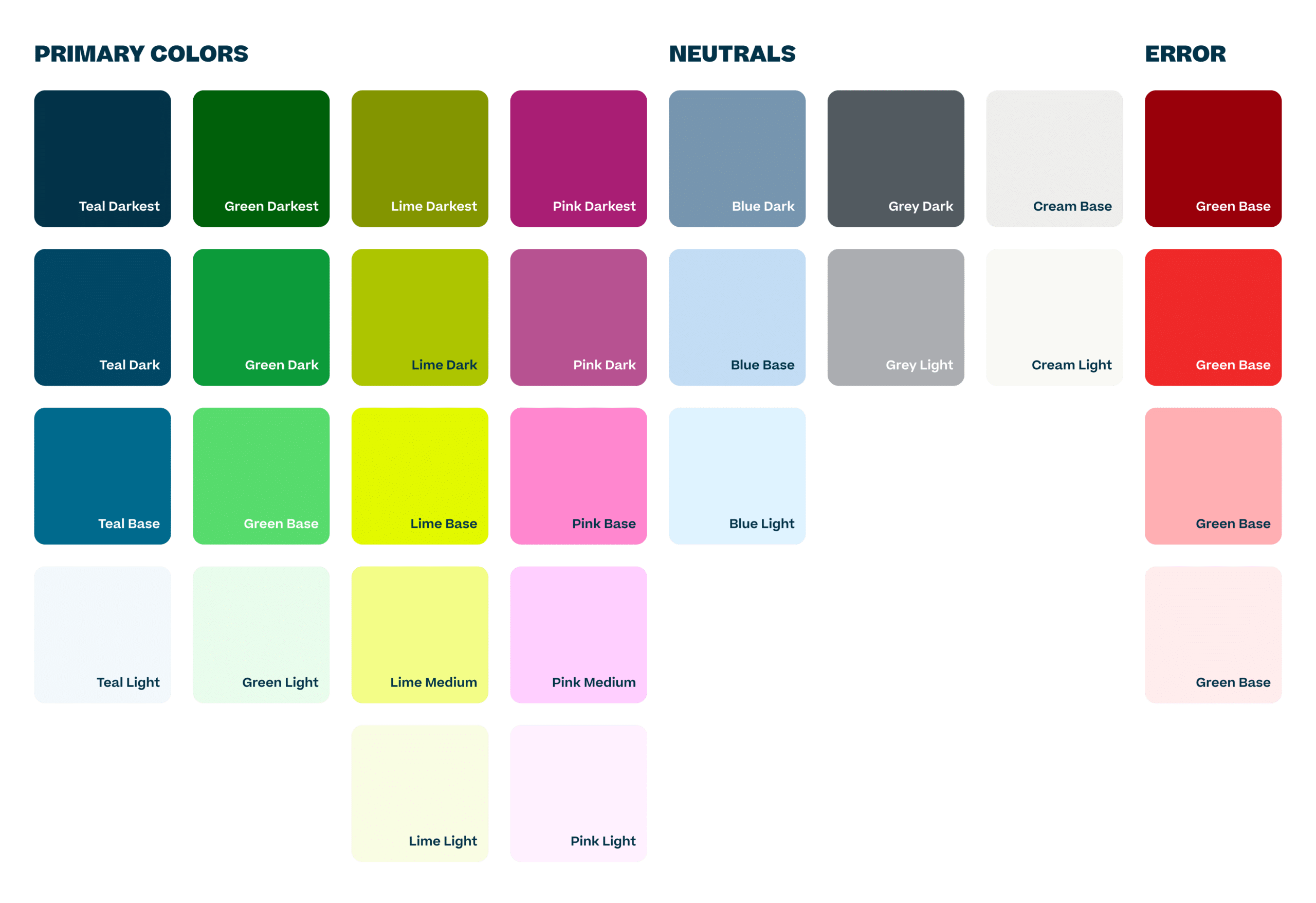
Expansion of color palette
instead of combining complex shapes and images, we only use simple shapes such as rectangles with rounded corners or circles.
